

When to use this
- 12‑month wall calendars (cover + monthly pages)
- Year‑at‑a‑glance poster calendars (all months on one page)
- Photo calendars (monthly grid + user photo area)
- Desk tent calendars or mini calendars (compact layouts)
- Strip or planner calendars (each month in one row, or one row per day with room to write)
Prerequisites
- A Print.App account with access to your Admin Designs
- At least one store installation set up (see Installation)
- Basic familiarity with adding text/images to a Design
1) Create a Calendar Design
- In your Admin Designs, create a new Design for your product size (e.g., A3, Letter, 12×12 in).
- Add a Cover page (optional) and a Month page template you’ll duplicate.
- Set bleed/margins as needed. You can also review global Designer lines and snapping under Settings → Designer Settings.
2) Enable the Calendar module
- Open the Design in the editor.
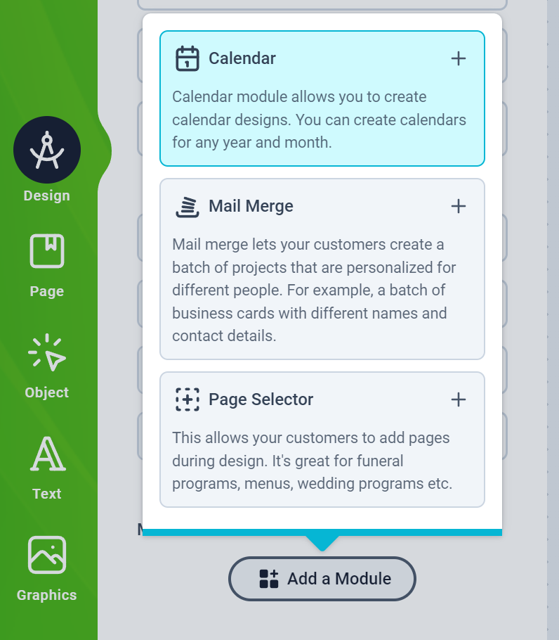
- In the left Design panel, click Add Module → Calendar.
- Choose a layout (Grid, Strip or List) and set the Year, labels, typography, lines and colors. Each setting is described in the Calendar Module guide.
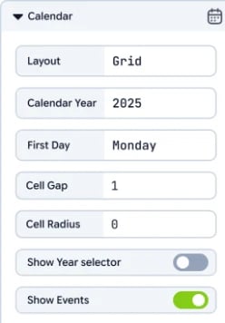
The Calendar module generates Month objects you can style like other elements. You can create one or many month grids and position them anywhere on your page(s).
3) Add and lay out months
Once the module is enabled, a Calendar button appears in the top menubar.-
Click the button to insert a Month onto the canvas.
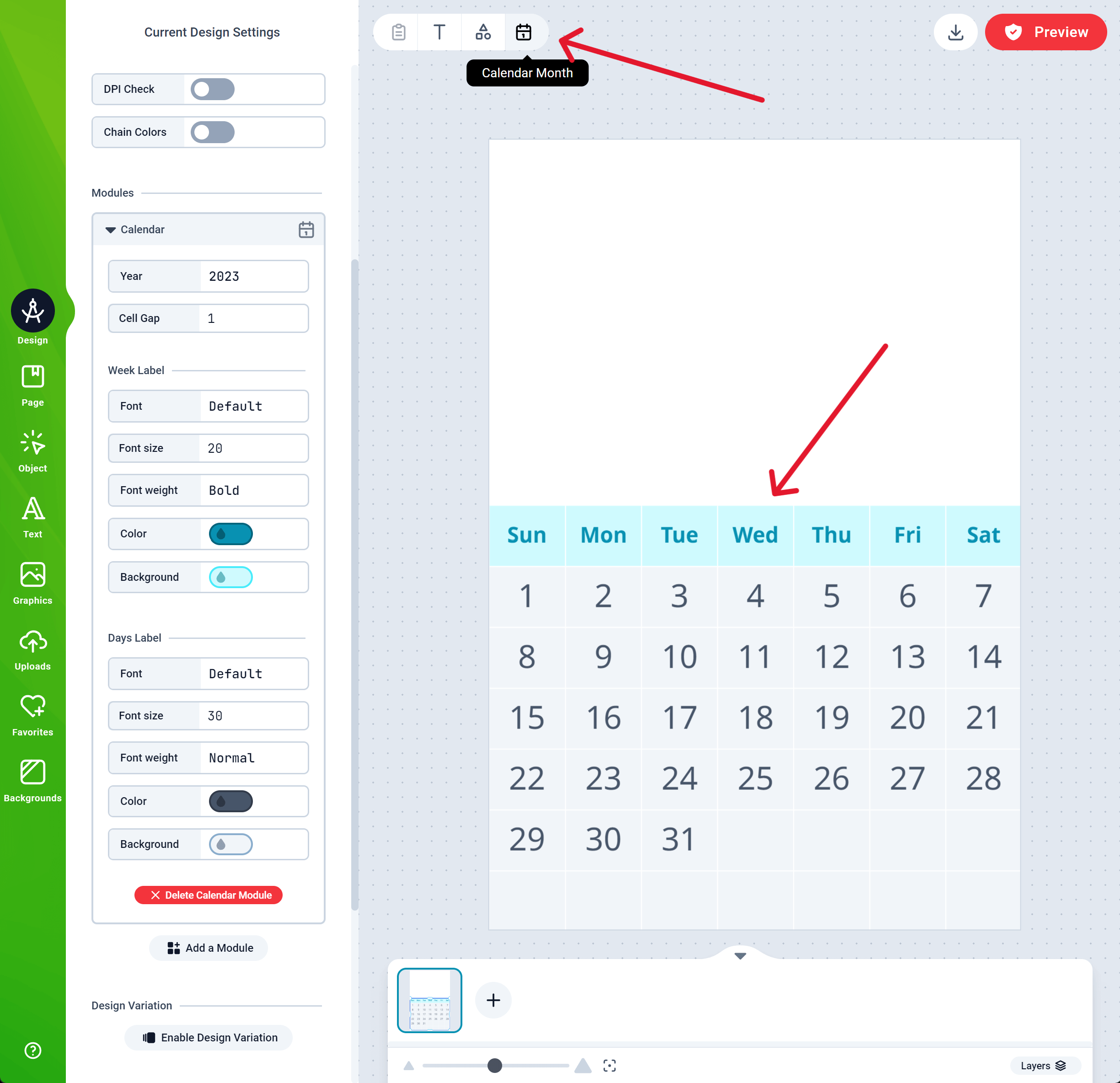
- For monthly pages: add one Month per page and position it under your artwork/photo area.
- For a yearly poster: add twelve Months to a single page and arrange them in a 3×4 grid (or your preferred layout).
Styling tips
- Use your brand fonts/colors for month names and day labels.
- For boxed or ruled grids, use the module’s Lines settings and date position (PrintFX editor), and check that line widths stay visible at your print size. See Example looks.
- Add holidays and special dates as Calendar Events: they print inside the date’s cell.
4) Add personalization areas
- Add an Image placeholder or a framed area above/beside the month grid for customer photos.
- Include optional caption Texts (e.g., “January Caption”), which customers can edit.
- Consider a cover page with a large photo area and a title Smart Text.
5) Prepare sizes, variants and finishing
- Create separate Designs for each size/aspect ratio you’ll sell (e.g., A3 vs Letter). Keep the month grid readable at print DPI.
- Add drill/punch marks, wire‑bind margins or clear safe areas in your template as needed.
- If you offer different start months (e.g., academic calendars), duplicate the Design and change the arranged sequence of months accordingly.
6) Assign to a product and test
- Save your Design.
- Assign it to a product on your platform (via your platform plugin) or integrate via Custom Installation.
- Open the product on your storefront and launch the Designer as a customer.
- Personalize: upload images, edit captions, review each month page.
- Save/Submit and verify the generated previews.
PDF output contains your final page sequence (cover + months). Ensure every page includes the correct month grid and any bleed/trim marks you require.
Quality checklist
- Month grids display the correct year and month names across all pages
- Day labels and week starts match your locale/style
- Photo/caption areas don’t overlap the grid at small screens
- Lines, cell gaps and type sizes remain legible at print size
- Bleed/margins are set, and punch/bind areas are clear of critical content
Troubleshooting
- Can’t see the Calendar button? Confirm the Calendar module is added to the Design.
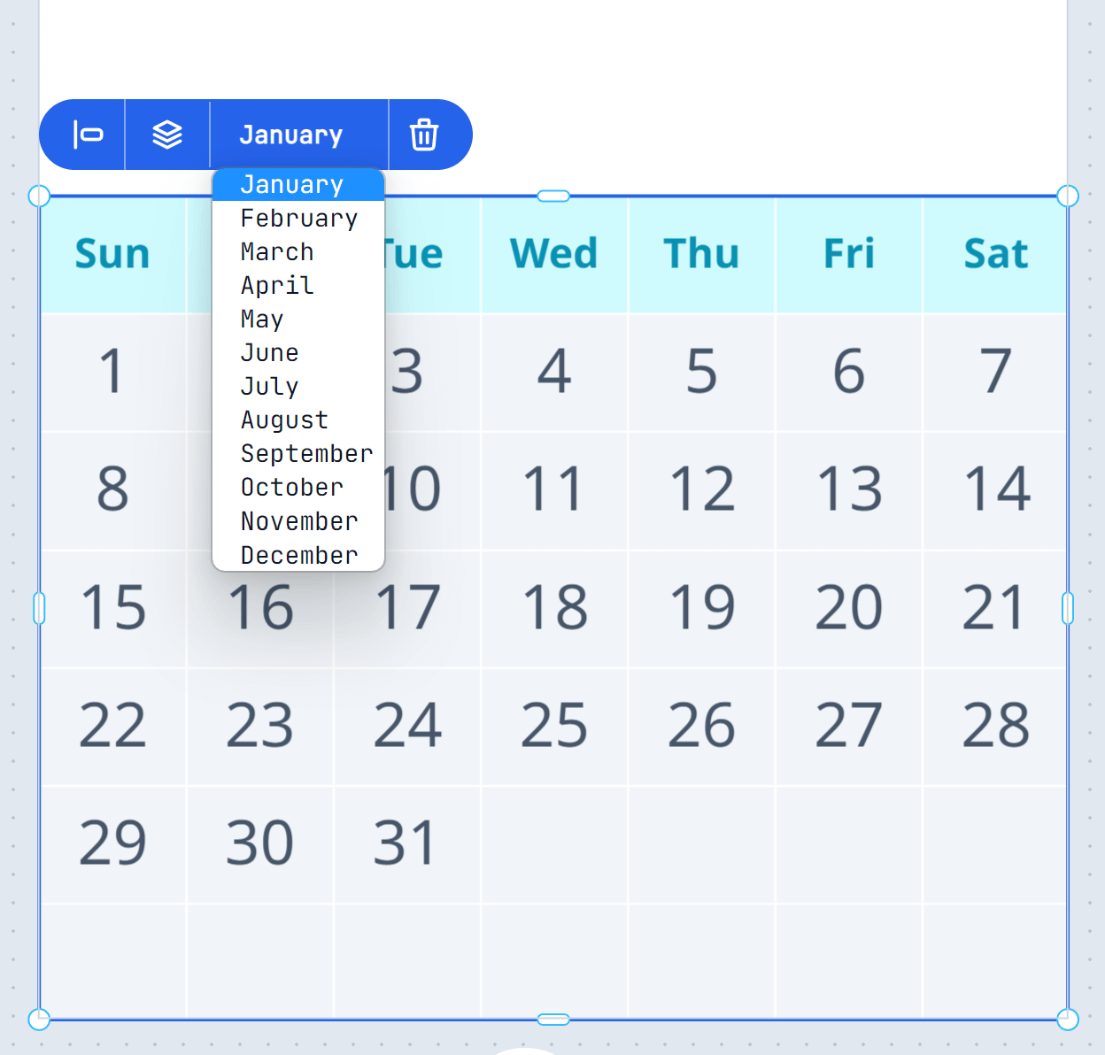
- Month shows wrong year? Select the Month object and update the date in its context menu; also review the module’s Year default.
- Customize button missing on your product page? See Installation and the troubleshooting note in that guide.